

We live in the era of data; today we deal with data systems that are larger than anything that humans have ever created. On average, a single person consumes 34 gigabytes of content every day, and as technological progress continues that number will climb and climb.
In the world of short attention spans and constant information overload, we need a simple way of comprehending large amounts of data. Data should be a ubiquitous resource that can be shaped to optimize its readability. By visualizing data, you can turn it into a format that is both easily explored and consumed.
At Red Nucleus, we remain at the forefront of data visualization trends to build future-proofed, engaging tools and experiences. In this document we explore the current Data Visualization landscape, best practices, and potential mediums for practicing that help to inform our work.
What is Data Visualization?
“Data changes how we draw conclusions about the world; data visualization helps us better understand data.”

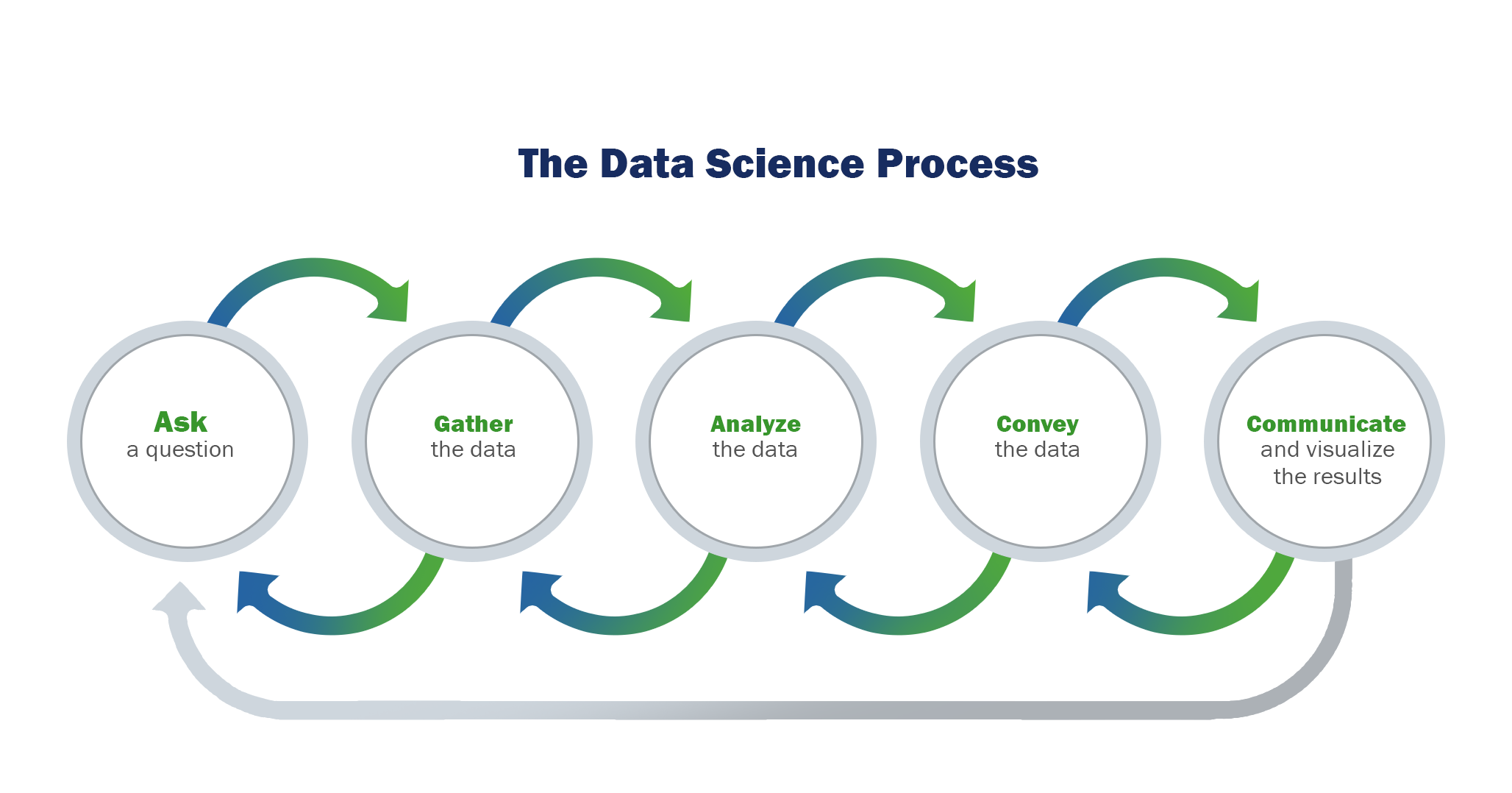
Figure 1: The data science process promotes the visualization of data as an important step in communication and storytelling.
Data visualization refers to techniques used to communicate insights from data through visual representation. Its main goal is to distill large datasets into visual graphics to allow for easy understanding of complex relationships within data. It is often used interchangeably with terms such as information graphics, statistical graphics, and information visualization.
Data visualization is one of the steps of the data science process developed by Joe Blitzstein, which is a framework for approaching data science tasks (Figure 1). After data is collected, processed, and modeled, the relationships need to be visualized so conclusions and larger-scale inferences can be made. Data visualization is also a component of the broader discipline of data presentation architecture (DPA), which seeks to identify, locate, manipulate, format, and present data in the most efficient way. Key insights can be made prominent via skillful use of design properties and visual principles to prioritize stimulation of the attention, knowledge translation, retention, and extrapolation portions of our cognitive learning (and thinking) pathways.
Why Data Visualizations Work
To understand the science behind data visualization, we must first discuss how humans gather and process information. Daniel Kahneman and Amos Tversky did extensive research on how human beings form thoughts, and concluded that in any processing event, one of two systems is used:
System I
Describes thought-processing that is fast, automatic, and unconscious. Used everyday for tasks like:
- Reading text on a sign
- Determining the source of a sound
- Solving 1+1
- Recognizing the difference between colors
- Riding a bike
System II
Describes a slow, logical, infrequent, and calculating thought. Includes tasks like:
- Distinguishing the difference in meaning behind multiple signs side-by-side
- Reciting a phone number
- Understanding complex social cues
- Solving 23 x 21
With these two systems of thinking defined, Kahneman explains why humans struggle to think in terms of statistics. He asserts that System I thinking is based on biases to handle the volume of stimuli we encounter daily. Some examples of biases related to thinking include:
Anchoring
A tendency to be swayed by irrelevant numbers. For example, this bias is manipulated by negotiators who offer a lower price (known as the anchor) than they expect to get and then come in slightly higher above the anchor.
Availability
It is believed that events that can be remembered are more likely to occur, but the frequency at which events occur in our mind are not accurate reflections of the actual probabilities.
Framing
Framing refers to the context in which choices are presented. For example, more subjects were inclined to opt for a surgery if it was framed by a 90% survival rate as opposed to a 10% mortality rate.
Optimism and loss aversion
Optimism and loss aversion give us the illusion of control because we tend to deal only with the possibility of known outcomes that have been observed. We often don’t consider known unknowns or completely unforeseen outcomes. Our neglect of this complexity explains why we use a small sample size to make strong assumptions about future outcomes.
Substitution
This refers to the tendency to substitute difficult questions with simpler ones, or to assume that specific, detailed conditions are more probable than a single, general one.
Sunk cost
This bias is often seen when investors continue to invest in an under-performing asset with poor prospects instead of withdrawing or switching the investment into an asset with a more favourable outlook or profile.
With Systems I and II, along with the outlined biases, it is important to ensure that data is presented in a way that communicates with the System I thought process. This allows the System II thought process to analyze data accurately. The subconscious System I has the ability to process about 11 million pieces of information per second vs. the conscious System II, which can process only ~40 pieces of information per second. According to Tor Norretanders’ The User Illusion, the visual sense processes the most information in both systems (Figure 2).

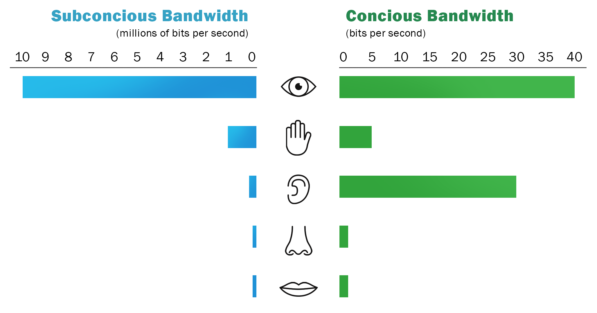
Figure 2: Subconscious and conscious processing prefer visual uptake of information.
Because the subconscious system processes more information through vision, data visualization is a perfect solution to communicate patterns and insights from data sets. When someone sees a data visualization, it will take less than 500 milliseconds for the eye and the brain to process what are called “pre-attentive visual properties” of an image. According to Colin Ware’s Information Visualization: Perception for Design, he defines four pre-attentive visual properties:
- Color (eg. hue, intensity)
- Form (eg. length, width, orientation, curvature, size, shape, added marks, enclosure, blur, grouping)
- Movement (eg. flickering motion)
- Spatial positioning (eg. 2D position)
These four components (Figure 3) make up the composition of each data visualization and should be carefully considered for presentation.

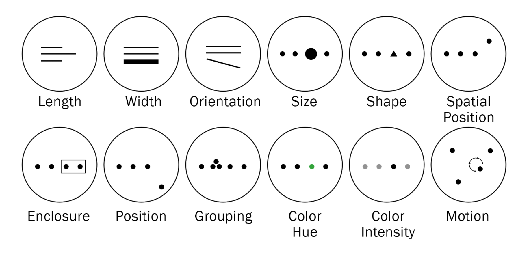
Figure 3: The components of pre-attentive visual properties that should be considered when designing data and creating data visualizations.
What do Data Visualizations Look Like?
Data visualizations can take on several different forms and can use a variety of different data. Figure 4 outlines a handful of common and uncommon data visualization types. There are many other forms of data visualizations out there, and most depictions and styles depend on the context, desired communicable story, and availability of data.

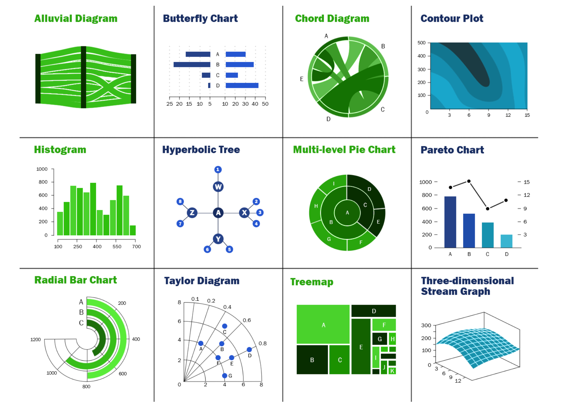
Figure 4: Types of data visualizations.
Data Visualization Best Practices
Because large data sets are difficult to comprehend in any meaningful way—and many of the most useful data sets contain huge amounts of valuable data—data visualization has become a vital resource for decision makers. To take advantage of all this data, many businesses see the value of data visualizations in enabling decision-makers to understand difficult concepts, identify new patterns, and develop data-driven insights in order to make better decisions.
Depending on its attributes, data may be represented in many ways. It is important to adhere to data visualization best practices and determine the best way to present a data set visually. Data visualizations should be useful, visually appealing, and never misleading. Developing a cohesive format is vital to creating visualizations that are both useful and visually appealing, particularly when working with very large data sets.
Know the Audience
To ensure that visualizations are effective, start by asking who the audience is. Data visualizations should be used to empower a specific audience and address their needs. Keep in mind that that not all end-users will perceive the information in the same way.
Ask these questions before you get started:
- Who is this data being visualized for?
- What decision do I want the user to make and under what circumstance?
- What actions do I want people to take with this insight?
Choose the Right Chart Type
Choosing the right chart type will help you tell your data’s story. The appropriate chart will reveal patterns and trends, so the audience instantly understands the significance of the data set. Figure 5 presents an easy-to-follow decision path chart for selecting the appropriate chart type.

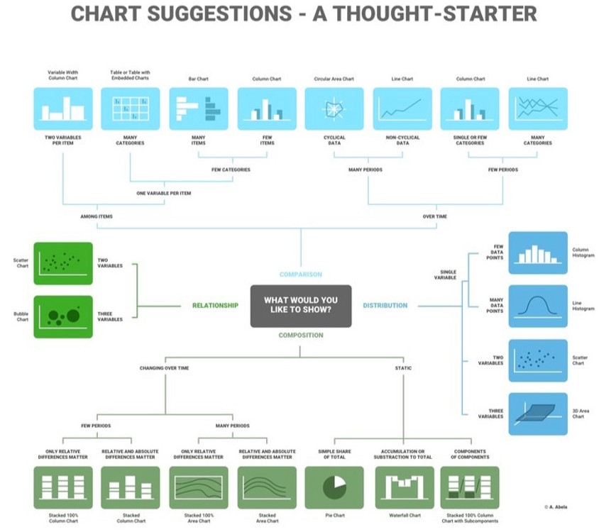
Figure 5: A decision flow-chart that aids in selecting the appropriate chart type for the data and its corresponding communicable message. Using the correct visual strategy for data visualization is important in communicating key insights and trends with ease.
© Dr. Andrew V. Abela, 2020, used with permission.
Keep it Organized and Coherent
A coherent design will effectively fade into the background, enabling users to easily process information. The best visualizations help viewers reach conclusions about the data being presented without being “in-your-face” or otherwise drawing attention to themselves.
Creating a hierarchy of data shows the various data points in a relevant way for decision makers. Sort highest to lowest to emphasize the largest values or prominently display a category that is more important to users. The order in which data is displayed, the colors used, and the size of various elements of a chart can help users interpret data more easily.
Make Data Visualization Inclusive
Color is used extensively as a way to represent and differentiate information and is a key factor in user decisions. Refrain from using subtle palettes as they make charts more difficult to analyze and interpret. This is especially true for people vision impairment—which, according to the WHO, is an estimated 253 million people.
Techniques that can improve graph readability:
- Use colors that have high contrast
- Complement the use of color with pattern or texture to convey different types of information
- Use text or icons to label elements
- Add annotations and comments for added context and perspective in charts
Design to Highlight What’s Important
Make critical insights and data points stand out by directing the audience’s attention to what’s important. Directing attention with conditional formatting, reference lines, or trends and forecasts increases time spent exploring charts and with the data, leading to a better understanding of the data’s significance.
A great data visualization should tell the story clearly and avoid distortions. Avoid the use of visual representations that don’t accurately represent the data set, like pie charts in 3D.
Make Insights Sharable
Data visualizations reveal insights, but real value is created when insights are shared and acted upon. The best data visualizations turn insights into action. Deliver insights to decision-makers wherever they make decisions.
Ways to share insights:
- Dashboards – Personalized dashboards help people monitor what’s important to them.
- Embed – Embed insights into the platforms and applications people use daily.
- Broadcast – Tell people when to take action with periodic reports and data-driven alerts.
- Live Presentations – Include real-time interactive charts to tell compelling stories live.
Channels for Data Visualization
Virtual and Mixed Reality
Although augmented and virtual reality are in their early days, they could fundamentally change the way we interact with and interpret data. Coming on the heels of the big data revolution, 3D visualizations in mixed reality are the right tool at the right time to help decision-makers understand and glean insights from huge data sets.
Humans are much better at perceiving the patterns and relationships in data when we are fully immersed in such a data space, looking at the data from the inside out rather than from the outside in, as is the case in all traditional visualization approaches. By adding this extra dimension to a data display, data can be easily navigated and understood using colors, shapes, transparencies, and animations.
Additionally, the opportunities for interactivity and collaboration within virtual and mixed reality make them natural platforms for collaborative data visualization and visual exploration. Users can interact with the data and with each other in a shared virtual space even if they are continents apart in the physical world.
Examples to note:
- The Wall Street Journal crafted a virtual reality guided tour of 21 years of the Nasdaq
- Google Labs created an interactive VR visualization about the UK’s EU Referendum
- Archaeological data visualization in VR: analysis of lamp finds at the Great Temple of Petra, a case study
Projection Mapping & Large Format
Combining the meaningfulness of data with the impact of design, data visualizations as large format installations and art are beginning to make their way into the industry. By leveraging traditional projectors, large wall-mounted display screens, and projection mapping technologies, data artists are transforming data into eye-catching showstopper pieces.
The large format size of these installations allows for large quantities of data to be displayed, unlike restrictions that should be considered on web, tablet, or mobile. The quality of the projectors and distance from the audience to the installation are considerations that should be taken into account for legibility of words, numbers, and colors—especially due to lighting within a space.
Given the size of these displays, this style of installation has a large impact and allows for multiple users to enjoy them at the same time. Building a large display as an entry point for a mobile experience allows all users to interact with the data simultaneously while also building an experience for multiple reuses and post-event shelf life.
Large Format Data Visualization Concept Examples

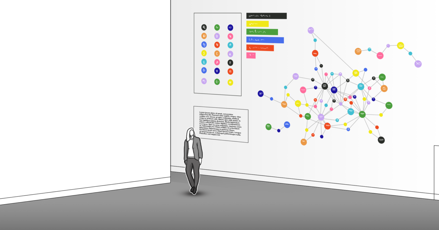


Touch or touchless interactivity can be built into large format visualizations for added engagement.
Social Media
Data visualization is becoming increasingly popular and receiving higher levels of engagement from followers on multiple social media platforms. Data scientists have identified this trend and are prioritizing data visualizations that are “social media friendly”—simple, concise, and immediately engaging to serve users’ short attention spans. Some examples of social media data visualizations include GIFs, looping animations, and YouTube shorts.
Data visualizations around current events on social media
Interactive data visualizations offer a new format that is great for social sharing. Marketers can quickly build interactive maps using available location data from social platforms or open data portals. Recently, data visualization featured prominently in major news stories, and key players in the field created work that was shared broadly beyond dataviz Twitter.
Case Study: COVID-19:
The COVID-19 pandemic is generating waves of data points from around the world, including the number of tests performed, cases confirmed, patients recovered, and people who have died from the virus. As these data are continuously updated, media outlets, government agencies, academics, and data-packaging firms make sense of the numbers using novel design and visualization tools to chart and graph the virus many different contexts.
Because information about the pandemic is quantitative—case counts, death counts, testing rates— it lends itself to data visualization. Maps, bar charts, and line charts of confirmed cases initially predominated, and still are the most common forms of visualization that we see in media reporting and on social media.
COVID-19 Data Visualization Examples:
- The John Hopkins University built perhaps the most popular and well-known dashboard that curates data from a collection of official reports posted by the WHO, the CDC, ECDC, NHC, and DYX. The map visualizes the cumulative spread of the virus at varying geographic resolutions and is often accompanied by supporting information on COVID-19 case status including the number of new cases, number of recovered cases, and number of deaths.
- NextStrain built tools to visualize the evolution and spread of the virus in real-time specifically for virologists, epidemiologists, public health officials, and community scientists.
- Infodemics Observatory is visualizing the digital conversation and information spread around the COVID-19 outbreak using machine learning techniques.
Tablet Application
Multi-touch input is now ubiquitous and the popularity of devices using it, such as tablets, has grown tremendously in recent years. Tablet devices present unique design challenges and opportunities that distinguish them from other platforms such as desktop computers. The ability to directly touch and manipulate data on screen without using any intermediary devices is very appealing to users. This has resulted in a new generation of applications that are developed entirely for touch screens. However, one area with only a limited exposure to touch-based input is information visualization. This is in part due to the constraints of designing for touch: the absence of a keyboard and mouse, the small screen size of handheld devices, and the dependence of visualization applications on widgets such as buttons, sliders, menus, and dialog boxes.
Design constraints to consider with tablet data visualizations include screen size and input size, grip (and the likelihood that the operator will only be using one hand), and lack of hover. Conversely, tablets provide several opportunities for data visualizations as well. Mobility is an obvious benefit, since it holds the promise of increasing the utility of tools to new usage scenarios and locations. Touch-based gestural input also presents an interesting opportunity by being more direct and natural compared to cursor-based input, given that gestures can be more expressive. Thus, a system leveraging touch in an effective manner could potentially support a wider variety of features with fewer UI elements.
Web Application
It is critical for visualizations to be seen for them to be impactful, and publishing on the web is the quickest way to reach a global audience. Working with web-standard technologies means that visualizations can be seen and experienced by anyone using a recent web browser, regardless of the operating system or device type.
When conceptualizing and planning a data visualization project for the web, consider whether to use third party data visualization tools. Proprietary software and plug-ins, such as Highchart or Tableau, offer easy implementation, screen responsiveness, and templated solutions for quick turn around. However, going with this route often means limitations in design and additional costs for licensing.
Another consideration when designing for the web is the level of interactivity. Although web applications do allow deep interactivity to be built into data visualizations, research suggests we cannot rely on interaction for building understanding, as only 10% to 15% of users typically click on graphs and charts when presented online. Key data must not be hidden behind interactive elements, and instead should be available without interaction. However, web application interactivity is great for integrating additional data that might otherwise be excluded to allow interested viewers to explore a dataset more deeply.
Data Visualizations in the Healthcare Industry
In the world of big data, data visualization tools and technologies are essential for analyzing massive amounts of information and making data-driven decisions. Big Data analytics is a growing interest in the healthcare industry. Like traditional business intelligence platforms, reporting is a critical Big Data analytics feature that allows data to be visualized in a useful way to support users’ daily operations and help managers make faster, better decisions. However, the most important output for health care may be its real-time monitoring of information such as alerts and proactive notifications, real time data navigation, and operational key performance indicators (KPIs). This information is analyzed from sources such as smart phones and personal medical devices and can be sent to interested users or made available in the form of dashboards in real time for monitoring patients’ health and preventing accidental medical events. Data dashboards are a growing application of data visualizations in the healthcare industry.
Emerging Trends
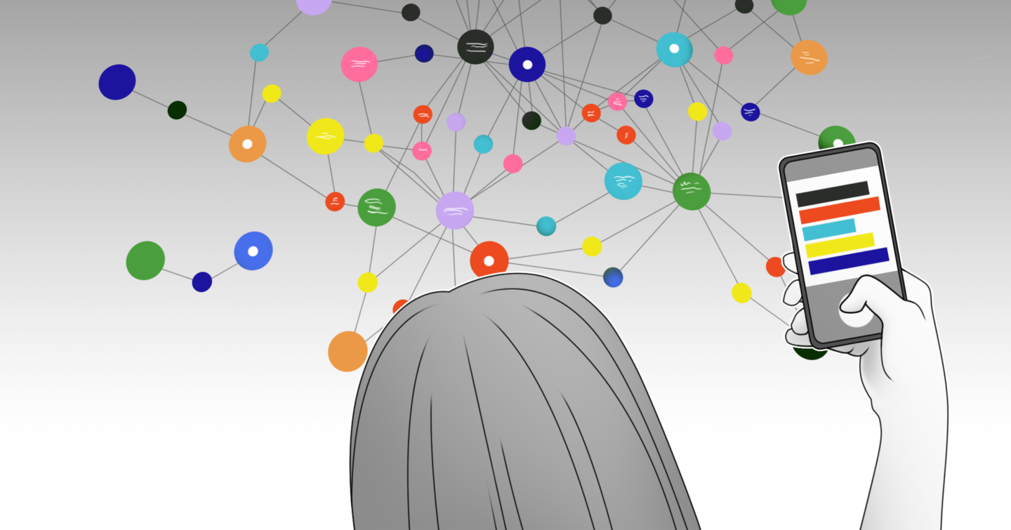
Mobile-First Visualizations
Innovations in mobile data visualizations are increasing alongside mobile consumer experiences. Many vendors are working on adapting desktop experiences and data visualization to mobile formats to embrace the mobile-first and social-first approaches.
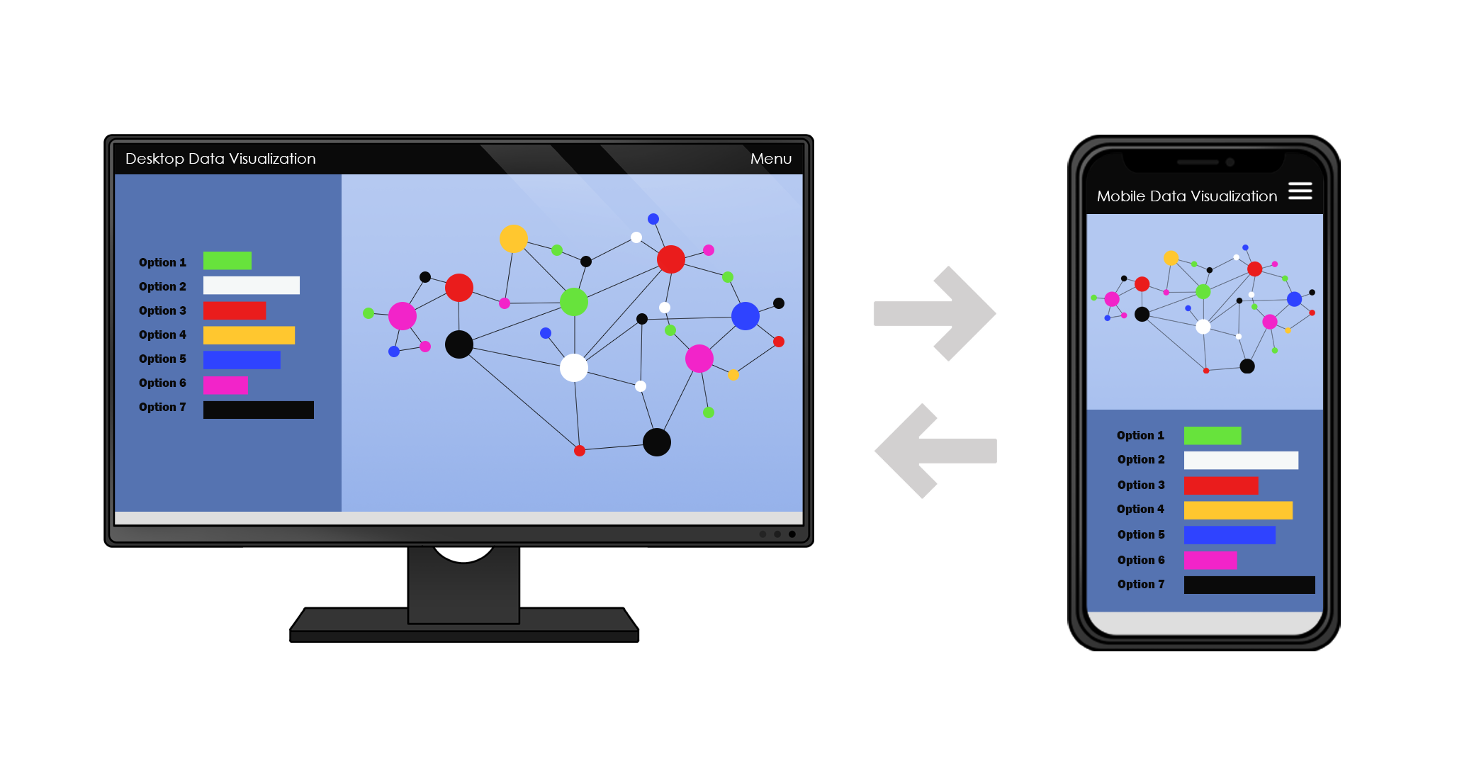
Concept example of desktop-to-mobile conversion:

Artificial Intelligence
The growth of Big Data has rendered data visualizations a crucial asset for businesses. Employing artificial intelligence can be helpful in identifying narratives hidden to the human eye. A machine learning system or algorithm can be employed to compare graphs, identify anomalies, detect key insights, and organize trends or patterns in large datasets. Natural language processing, a subfield of linguistics and information engineering, may be able to convert these trends into plain language or other communicable pieces (visual, social-first, etc.) for easier dissemination and communication.
AI systems that can generate realistic-looking images from textual descriptions have been developed recently. This suggests that in the future AI might make it possible to visualize data by chatting out loud with a computer, Star Trek-style—although it’s uncertain if this is even desirable.
Interestingly, this process can also run backwards: AI systems can generate text or speech from data or graphics and automatically caption them. This has been applied to data visualization as well, as seen in Tableau’s integration with Narrative Science. This image-to-text approach has also been extended to enable AI systems to use a sketch or visual specification to create a website by converting images to code (a structured form of text). AI systems can even dynamically generate new font faces or shoe designs based on visual examples of what is desired. In terms of applying these techniques to dataviz, Bret Victor’s Drawing Dynamic Visualizations and Adobe’s Project Lincoln demos show what non-AI sketch-based input systems might look like for visualization. It may be possible to blend these approaches to create an AI system that can take either a freehand sketch of some desired output or some examples of visualizations similar to the desired result and automatically create the code for a visualization pipeline that would generate the target visualization when applied to arbitrary data. If feasible, this would potentially represent AI systems competing with human business intelligence developers or data visualization designers, much like they already compete with human computer-vision programmers and may one day seriously compete with human translators or radiologists.
A natural next step beyond an AI system producing visualizations on demand as the result of a human query about data is the notion of an AI system suggesting interesting or useful visual representations of data without a query. This is sometimes called visualization recommendation, and has recently been an active area of data visualization. AI systems have already been used to create powerful and profitable recommendation systems for books, music, movies, clothing, and many other products, so there may be reason to believe that AI techniques could apply to visualization recommendation as well.
References
Kahneman, D. (2015). Thinking, fast and slow. New York: Farrar, Straus and Giroux.
Data Viz Project. (n.d.). Retrieved from https://datavizproject.com/
“Is the NASDAQ in Another Bubble? A Virtual Reality Tour of the NASDAQ.” The Wall Street Journal, Dow Jones & Company, 23 Apr. 2015, graphics.wsj.com/3d-nasdaq/.
“Will the UK Brexit?” Will the UK Brexit?, Google Trends, news-lab-brexit.appspot.com/en/.
Rogers, Simon. “How We Made a VR Data Visualization.” Simon Rogers, 20 June 2016, simonrogers. net/2016/06/20/how-we-made-a-vr-data-visualization/.
Acevedo, D., et al. “Archaeological Data Visualization in VR: Analysis of Lamp Finds at the Great Temple of Petra, a Case Study.” Proceedings Visualization, 2001. VIS 01., 2001, doi:10.1109/visual.2001.964560.
Rogers, Simon. “How We Made a VR Data Visualization.” Simon Rogers, 20 June 2016, simonrogers. net/2016/06/20/how-we-made-a-vr-data-visualization/.
Baur, Dominikus. “The death of interactive infographics.” Dominikus Baur, 13 March 2017, medium. com/@dominikus/the-end-of-interactive-visualizations-52c585dcafcb
Bremer, N. (2019, April 17). Techniques for Data Visualization on both Mobile & Desktop. Retrieved from https://www.visualcinnamon.com/2019/04/mobile-vs-desktop-dataviz
Zhang, H., Xu, T., & Li, H. (2017). StackGAN: Text to Photo-Realistic Image Synthesis with Stacked Generative Adversarial Networks. 2017 IEEE International Conference on Computer Vision (ICCV). doi: 10.1109/iccv.2017.629
Few, S. (2013, December 6). Is there a Role for Natural Language Processing in Data Visualization? Retrieved from https://www.perceptualedge.com/blog/?p=2539
Shallue, C. (2016, September 22). Show and Tell: image captioning open sourced in TensorFlow. Retrieved from https://ai.googleblog.com/2016/09/show-and-tell-image-captioning-open.html
Parks, S. (2019, July 23). Tableau Extension: Natural Language. Retrieved from https://narrativescience. com/products/quill/extensions/tableau/
Wilkins, Benjamin. “Sketching Interfaces.” Airbnb.Design, airbnb.design/sketching-interfaces/.
Beltramelli, Tony. “Generating Code from a Graphical User Interface Screenshot.” GitHub, 13 Dec. 2017, github.com/tonybeltramelli/pix2code.
Carter, Shan, and Michael Nielsen. “Using Artificial Intelligence to Augment Human Intelligence.” Distill, 22 May 2018, distill.pub/2017/aia/.
Victor, Bret. Vimeo, 1 Feb. 2013, vimeo.com/66085662.
Adobe Creative Cloud, director. #ProjectLincoln: Adobe MAX 2017 (Sneak Peeks) | Adobe Creative Cloud. YouTube, 21 Oct. 2017, https://www.youtube.com/watch?v=lX1BBMyY1bc.
Wongsuphasawat, Kanit, et al. “Voyager 2.” Proceedings of the 2017 CHI Conference on Human Factors in Computing Systems – CHI 17, 2017, doi:10.1145/3025453.3025768.
“COVID-19 Dashboard by the Centre for Systems Science and Engineering (CSSE) at Johns Hopkins
University (JHU)”, The Johns Hopkins University, 2020, https://coronavirus.jhu.edu/map.html“Covid19 Infodemics Observatory”, CoMuNe lab, 2020, https://covid19obs.fbk.eu/#/
“Will the UK ‘Brexit’? Top searches by European Union citizens about the UK’s potential exit from the EU.”
GoogleTrends, Jan-May 2016, http://news-lab-brexit.appspot.com/en/
Prepared by the Red Nucleus MedComms Creative Innovation Department. Note: The PDF for this article may contain branding from INVIVO Communications; now part of the Red Nucleus MedComms team.